Interactive Charts

Projects

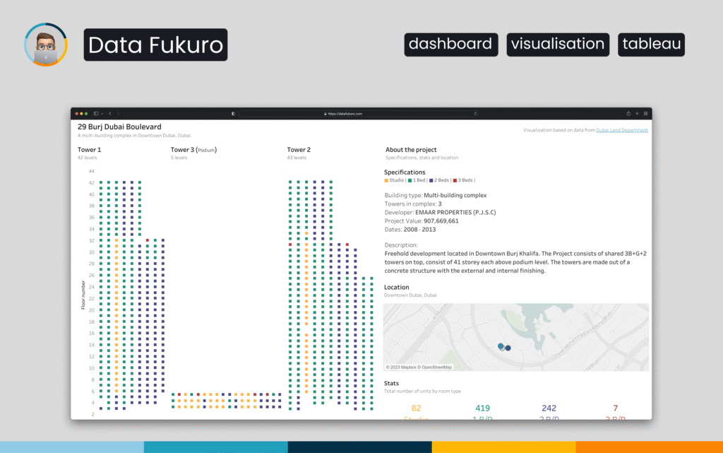
Real-Estate Visualization: Apartment Distribution in 29 BLVD Towers

This Tableau dashboard visualizes the 29 BLVD residential complex in Downtown Dubai using a floor-by-floor building layout. Each unit is represented as a coloured square mapped to its exact position within the towers. Users can explore apartment types, specifications and project details interactively, along with a geospatial view of the building’s location.

Projects

Visualizing Demographic Change in the United Arab Emirates

This Tableau dashboard visualizes the population dynamics of the United Arab Emirates from 1960 to 2021. Users can explore demographic trends by age group and gender through interactive filters and clear visual elements. The tool provides an accessible way to study long-term population shifts and compare different segments over time.

Projects

Dubai Rental Insights: Tableau Visualization

This Tableau dashboard visualizes rental market data from Dubai’s Downtown and DIFC districts. Users can explore prices by room type, compare median rents, view feature-driven price differences and analyze spatial patterns across major towers. The tool provides a clear, interactive overview of the rental landscape and supports smarter property research.

Scroll to Top